Day 10. More CSS Grid
October 12, 2019
Autofit, Autofill and Minmax
We can let CSS calculate the number of columns or rows by specifying the auto-fill keyword
.container {
  display: grid;
  grid-gap: 20px;
  border: 10px solid var(--yellow);
  grid-template-columns: repeat(auto-fill, 150px);
}
auto-fill and auto-fit seem like they do the same things, but the real difference shows when we have fewer elements than we have declared in our CSS.
auto-fit collapses the explicit track to the last element while the auto-fill lets the track stay on the main width of the container.
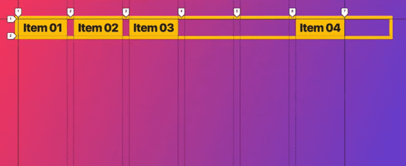
A typical use case is spacing elements. If we set the repeat() function to auto-fill and we set grid-template-end to -1, then the last row will move to the very end.
- With
auto-fit
- With
auto-fill
- We can use
minmax()to arrive at impressive layouts.
Take for example,
grid-template-columns: repeat(auto-fit, minmax(150px, 1fr));This code is going to set the minimum and maximum width of each of the grid children.
Grid Template Areas
We can give specific names to areas in our grids.
.container {
  display: grid;
  grid-gap: 20px;
  grid-template-columns: 1fr 500px 1fr;
  grid-template-rows: 150px 150px 100px;
  grid-template-areas:
    "sidebar-1 content sidebar-2"
    "sidebar-1 content sidebar-2"
    "footer footer footer";
}
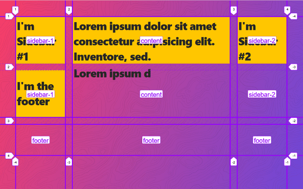
If we run this in firefox with our devtools open, this gives us very nice delimiters on our grid areas.
We can then go define the grid-area property on the grid children like so
.item1 {
  grid-area: sidebar-1;
}
.item2 {
  grid-area: content;
}
.item3 {
  grid-area: sidebar-2;
}
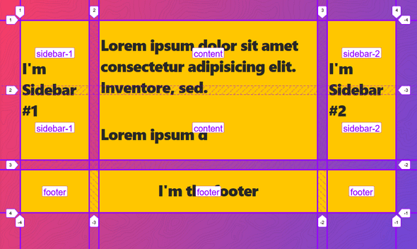
This will result in this layout
Naming lines in CSS Grids
We can name lines by adding [] to our template definition.
.container {
  display: grid;
  grid-gap: 20px;
  /* Naming the four column track lines */
  grid-template-column: [sidebar-start] 1fr [content-end] 500px [content-end] 1fr [site-right];
  /* Naming the three row track lines */
  grid-template-rows: [content-top] repeat(10, auto) [content-bottom];
}

.item3 {
  background: slateblue;
  /* Specifying the start and span lines of the column */
  grid-column: content-start;
  /* Specifying the start and span lines of the row */
  grid-row: content-top / content-bottom;
}
Grid Auto flow
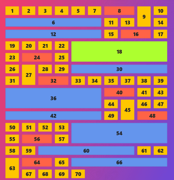
This is a baby. grid-auto-flow makes elements fill up leftover space in the layout. See this example
.container {
  display: grid;
  grid-gap: 20px;
  grid-template-columns: repeat(10, 1fr);
}
.item:nth-child(6n) {
  background: cornflowerblue;
  grid-column: span 6;
}
.item:nth-child(8n) {
  background: tomato;
  grid-column: span 2;
}
.item:nth-child(9n) {
  grid-row: span 2;
}
.item18 {
  background: greenyellow !important;
  grid-column-end: -1 !important;
}
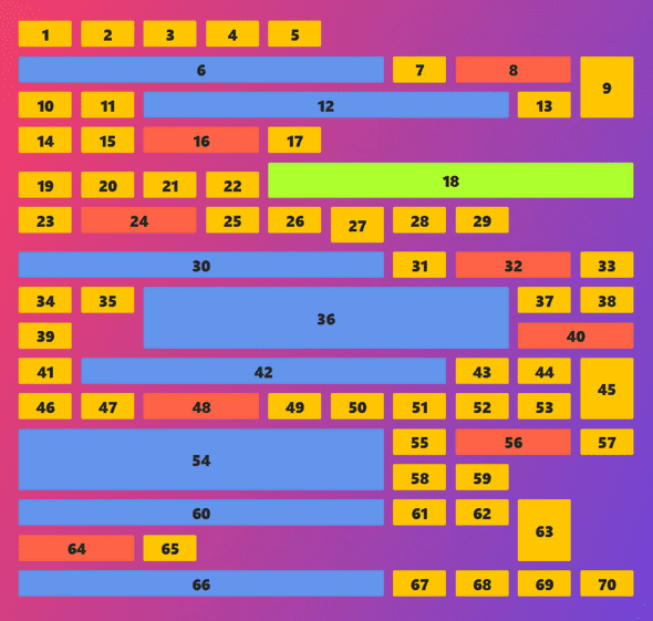
The result is something more like this
While this looks cool, it’s not something I would really be proud of. We could fill all those empty spaces by adding grid-auto-flow: dense;
.container {
  display: grid;
  grid-gap: 20px;
  grid-template-columns: repeat(10, 1fr);
  grid-auto-flow: dense;
}
We get this beautiful boy right here
Alignment & Centering
Centering content with CSS Grids is super easy. We are given the justify-items, align-items, justify-content, align-content, justify-self and align-self . Also the place-items property.
Justify-* is on the x-axis and Align-* is on the y-axis. *-self targets the specific children inside the grid container. Things work just like in flexbox, except that we can’t change the direction with flex-direction.
Reordering Items
We can order grid items with the order property.
.item1 {
  order: 1;
}
If this doesn’t work, then we have to add the order property to all other grid children elements.
That’s all for today, see you tomorrow.

