Day 13. Relearning Flexbox
October 15, 2019
Notes
- The differences between
inline-flexandflex:display:flexelements will span the 100% of available space whileinline-flexwill span the culmulative width of the children. - The default value of
flex-directionisrow. Other values arecolumn,row-reverseandcolumn-reverse. - The
main axisin flexbox goes from left to right. While the cross axis goes from top to bottom. This is the reverse when you change theflex-directionto column. - If the
flex-directionproperty of an element is set torowand theflex-wrapproperty is set towrap, the height of the flex items always sum to the height of the flex container. - Unlike CSS Grids, flexbox doesn’t provide a flexible way to add gaps or gutters to layout items. I normally make use of a percentage margin like so.
.flex {
  display: flex;
}

.flex__item {
  flex: 33%;
  margin: 1%;
}
This mostly gets the job done for me, but I learned of a more flexible way to do so with the calc() function.
.flex {
  display: flex;
}

.flex__item {
  flex: calc(33.33% - 20px);
}- How the
orderproperty works in flexbox: All flex items have a default order of0. Setting theorderproperty on a flex item automatically takes it to the end of all the flex parent. You have to explicitly set the order of all the elements you want to reorder. Justify-contentspecifies how the elements are aligned on themain axis. The options areflex-state(default),flex-end(All items are flexed to the end).center(All elements at the center).space-between,space-around.align-itemsenables positioning items in the cross axis (y-axis whenflex-directionis set torow. The default value isstretch. It shares the same values with thejustify-contentproperty. Except that it adds thebaselinevalue that’ll align items according to the base of the text-content of the flex children.- Differences between
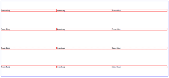
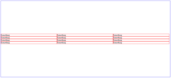
align-contentandalign-items. align-items will position flex items in relation to their rows, while align-content will do so in relation to the whole flex-container. Here’s a perfect example…
<div class="div">
  <li class="item">Something</li>
  <li class="item">Something</li>
  <li class="item">Something</li>
  <li class="item">Something</li>
  <li class="item">Something</li>
  <li class="item">Something</li>
  <li class="item">Something</li>
  <li class="item">Something</li>
  <li class="item">Something</li>
  <li class="item">Something</li>
  <li class="item">Something</li>
  <li class="item">Something</li>
</div>
and CSS
<style>
li {
    list-style: none;
}
.div {
    display: flex;
    flex-wrap: wrap;
    /* align-items will position elements along the cross-axis of their individual rows */
    align-items: center;
    height: 80vh;
}
.item {
    flex-basis: 33%;
    border: 1px solid red;
}
</style>
Here’s what the code will result in

When we change the align-items property to align-content, here’s what we get.
That’s all for today. See you!
